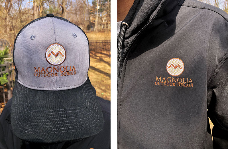
Grand Rapids hardscape and landscape company, Magnolia Outdoor Design, needed a fresh new look for their brand new business. Spring was right around the corner so business cards, shirts and caps were a must. Dog Ear created a logo that represents the services Magnolia provides to our neighborhoods this spring and many springs to come.
Logo and Brand
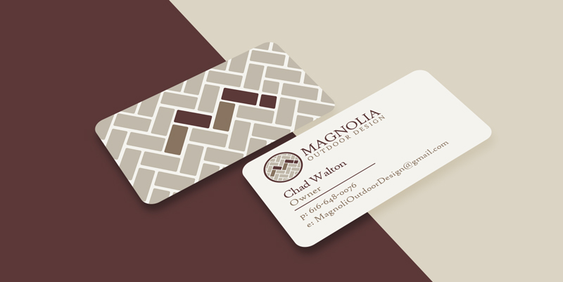
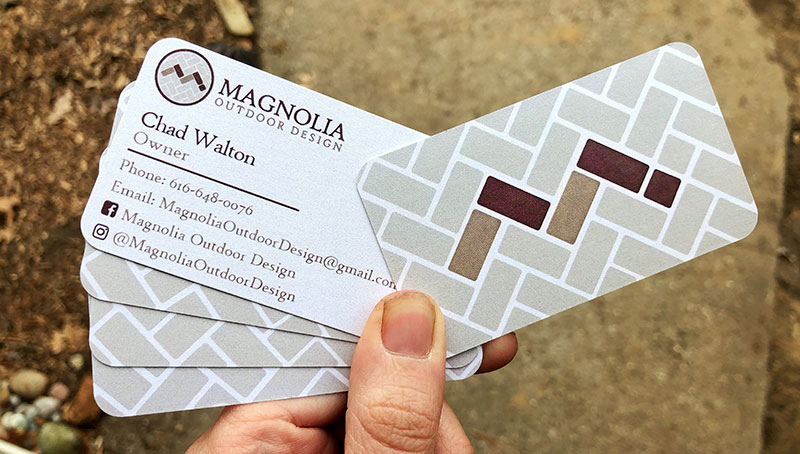
Magnolia came to us in need of a logo so they could start branding and snagging clients this spring. They mentioned wanting a more "up-scale, bougie" logo to cater to their clientele, while still maintaining the down-to-earth feeling their work and personality embodies. I played with a lot of brick patterns since their top service is hardscaping and fire-pit installation. Basically, they create the spaces we enjoy outdoors as we gather around a fire with family and friends. While it can be difficult to combine both a laid-back and up-scale look, I think this logo rises to the task. The M is made from the herringbone style brickwork. The brick shape can also be used as a branding element, like their brick shaped business cards.
Website
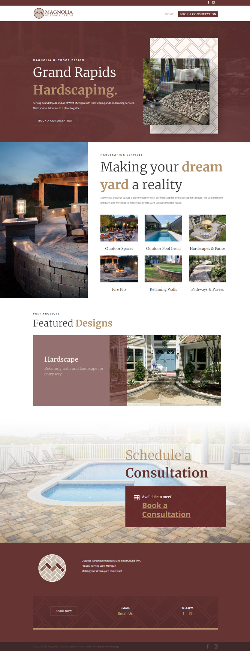
Dog Ear also put together Magnolia's site that lists services and where clients can schedule consultations. This makes the education and scheduling process smoother so Magnolia can concentrate on their hardscaping projects. We host, designed and developed the site on WordPress.
Have an awesome business in need of an awesome logo? Send us a message!
