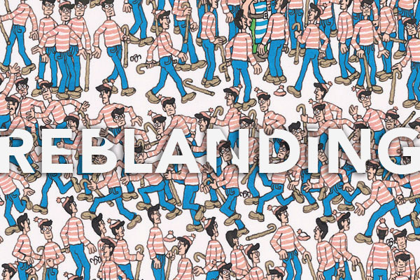
How companies across the globe are ditching their standout brands for ones that blend in and how designers are coping.
What’s Happening and Why
In the last decade, there has been a major shift on how logos look and function. Gone are the days where a logo was bold and unique enough to stand out on its own. The custom, adorned fonts of days past have been replaced with modern sans-serifs. Complex and detailed logo images have been replaced with minimalistic icons. Designers now rely on other brand elements, like color, to create a stand out brand. For example, both gradients and bold, contrasting colors have exploded in use in order to catch the customer's eye.
Is This a Bad Thing?
Well no, not if you’re one of the few doing it. However, so many have gone this route that every logo is starting to look the same. This defeats the purpose and effectiveness of branding as more companies lose their own identity in the mix.
Staples is the latest example in the reblanding trend. Their old logo was clever and original. The new logo is, you guessed it-- a lowercase sans-serif font with a simplistic staple icon.
But hey, minimal design is perceived as clean and that’s what the people want, right? However, is it possible we prefer clean, modern logos solely because that’s where the trend needle is pointing? Could there be benefits to simplicity that the modern era is calling for? Getting rid of all the excess ornamentation is starting to make us wonder why logos ever had flare in the first place.
Advantages of Minimilist Design
There’s a right way to minimalize and it even has several advantages:
- - For one, having a symmetrical, simplistic icon to represent your brand is becoming more important with the use of small devices like phones, tablets and laptops. Every app needs a small icon to represent it.
- - Another benefit is the consistency that minimalist design brings to a brand. In order to be memorable, branding needs to be consistent throughout, and an overly simplified design is the easiest way to make it happen
- - Minimalist design strips unnecessary extras that take a an extra second to digest, keeping only the important aspects of the design.
- - Brands are finding more ways to stand out with other branding elements like color, patterns, images and more
- - People are over saturated with advertisements, commercials and media wherever they look. Attention spans are shorter, so less is more.
- - Minimalism is hot right now. People respond positively to it and enjoy it. Why not capitalize on this trend if you have the money to rebrand?
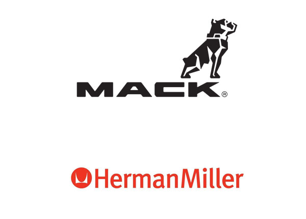
Some great examples of companies that have minimalist logos and still stand out are Mack Trucks and Herman Miller. Both fonts are sans-serif, but unique. So too are the logomarks, they stand out and represent the company easily and definitively. Herman miller has had a version of its infamous ‘H’ logo since 1946. Recently, they separated their logomark from the logotype, using only the logomark in much of their media and advertising. Even though these logos are simple, they are unique enough to keep their impact and recognizability.
Exploring New Ways to Brand
The strongest case against minimalism is the loss of brand identity. When everyone looks the same, no one stands out. A solution to this dilemma is already being solved by designers and marketing teams. They no longer rely so heavily on the logo and are differentiating themselves in new, innovative ways.
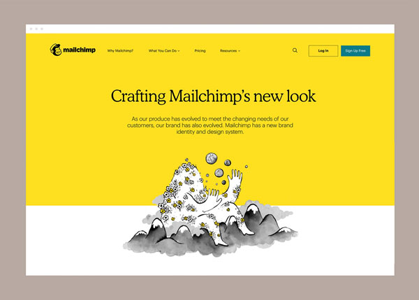
For example, MailChimp’s newest rebrand simplified their logo but incorporated tons of other elements in order to stand out. Their rebrand includes distinctive sketched drawings and a bold color scheme. It was as if the logo was one of the least important elements of the rebrand. These innovations will continue as companies find ways to differentiate, and ‘reblanding’ just might increase creativity in these and other areas of marketing.
Conclusion
While there is legitimate concern that this trend of logo minimalism is reducing the role of creativity in logo design, it’s important to remember the benefits to branding as a whole. Having a simplified logo allows for consistent and impactful branding, while also providing a need to differentiate in other creative and innovative ways.
Like any trend, this is bound to transform or die out. With the increasing number of brands that are taking part in minimalism, this process is speeding up. Soon, we may turn back to more complex, defined logos and possibly even tone down the colors. Time will tell.
Interested in a logo or rebrand for your business? We promise it won’t be bland! Contact us for a quote or to learn more. Check out some of Dog Ear Marketing's other branding projects on our Behance Profile.