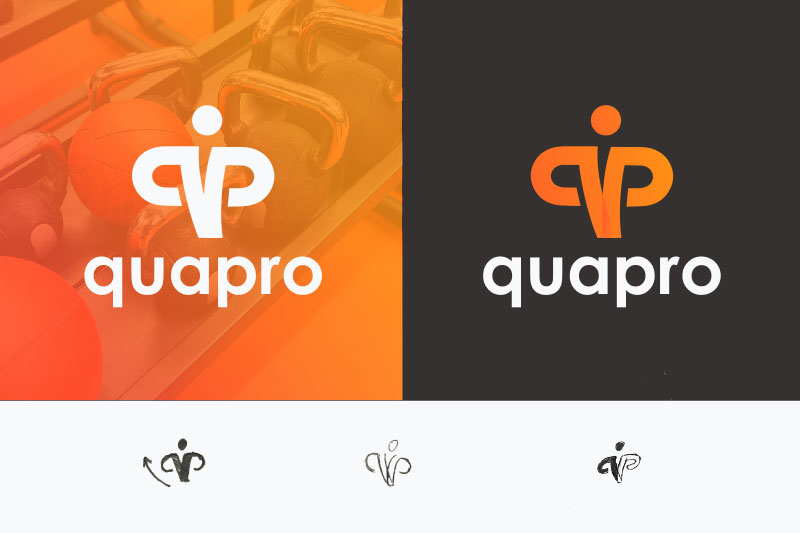
Quapro is an online fitness products company headquartered in Frankfurt, Germany. This presentation outlines the process of updating their logo, a stock image the company had bought online. The new logo seeks to impress with a feeling of assurance and strength. The design combines the initials q and p with an athlete flexing and presenting a confident posture to the world. The chosen colors also pay homage to the company’s German origins.


Check out this and other re-brand projects on our Behance Profile, and get in touch with us to mark your place!